Concept Development — Wireframing
- Fisnik

- Nov 12, 2018
- 1 min read
Updated: Dec 25, 2018
I started thinking about the outcome of my project, the designed prototype. This interface needs to demonstrate how the user interacts with the system. How is the user collecting these wasted points and exchanging them? The wireframes below show some examples of these interactions and transactions.

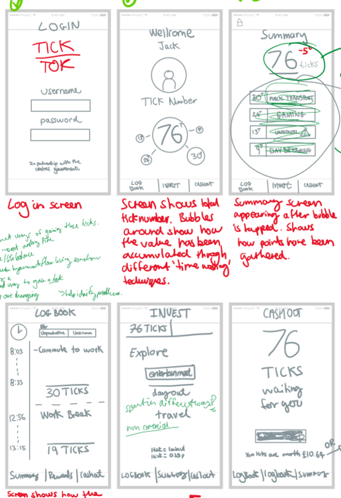

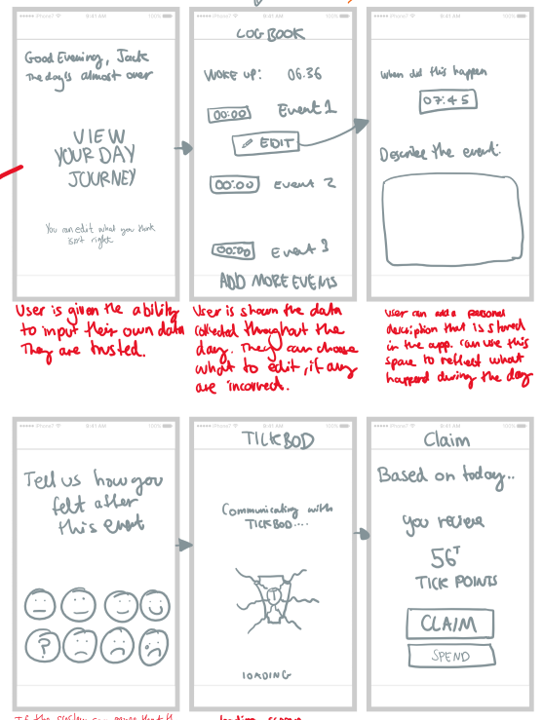
As this is quite a speculative project, in terms of the app and how it realises what the user is up to throughout their day, how they feel, there will be a section allowing the user to edit and logs made by the algorithm. I have shown the wireframe below above of what this might look like.
I then took these wireframes and further developed them, creating an interactive prototype using Adobe XD. This can be viewed below.
Initial Interface Design Idea

The approach I took for this design was linked to colour. The different colours represent the different aspects of the interface. For example, the grey represents logging into the app and when it is initially opened. Blue shows the main user interface where their points are shown. Green represents the area of the app where the user inputs how they were feeling during a certain event. And finally, yellow represents claiming the points generated. Initially, I was happy with this method. I concluded from my design research that this was a good idea as it was also incorporated by the mental health app Moodnotes. Some classmates I asked for their opinion said they liked it however, I think I should make the interface uniform and think of another way to represent the different interfaces, maybe through an icon?


Comments