Final Presentation & Crit
- Fisnik

- Jan 10, 2019
- 5 min read
Updated: Jan 15, 2019
I have developed a digital currency with the aims of improving a person’s self-help by bringing greater awareness to mental health issues in our society and the ways in which someone can improve their own wellbeing. The currency is called Tickero, with the strap line ‘help yourself to rewards’.
I have created a range of prototypes to support how my system works. The first is the marketing webpage created using HTML and CSS. This is the first point (possibly after advertisements seen by the user) where a potential user interacts with Tickero. At the moment there is a little bit of information on the site explaining what Tickero is, as well as a login section for current users and a section for somebody to register their interest in Tickero.
After a user registers their interest on the marketing website, the user would receive the Tickero getting started guide through the post, accompanied by the physical artefact I have designed at created – the TICKBod. This represents the early stages in the user jounry map in getting someone to sign up for Tickero. The guide explains to the user how the system works and how they can sign up.
It also offers the user two vouchers at the back, one for them and another for a friend. These vouchers provide the user with their first TICK points before they event start using the system and also acts as a way to get more people involved and using the currency – as well as more people being exposed to way to improve their wellbeing.
Then there is the information letter the user receives. (see below) It can be received by email as an attachment or in physical form through the post. It explains how the system works in more detail, showing images of the app interface and what each sections of the app represents. These letters explain to the user for the first time the actions they need to take in the app to start earning TICKs and claiming rewards.
And then there is the speculative physical artefact – the TICKBod - a necklace I have designed and prototyped using 3D software – SketchUp and printed with a 3D printer here in LCC. (see image below) It is worn around the user’s neck and connects with the Tickero app downloaded on their mobile device. The TICKBod is a device with the ability to understand what the wearer is doing and how they are feeling. Ways which this could be achieved with the technology available today is through the use of some of the same sensors found on smart phones. For instance, GPS to detect where the user is. If TICKBod notices the user is in a public place, say at a football stadium, it can understand that they are probably out with others socialising and possibly having fun. This information is highly reliable to the Tickero system in decided how they are rewarded later on. Other features of the TICKBod include listening for keywords such as ‘I feel sad, happy, tired’. Any term that could help in judging how the user feels. This is also why I have gone for a necklace, say instead of a wrist band. Necklace is closer to the users mouth and can listen for keywords. Furthermore, the small circular holes on the back of the TICKBod are there to measure heart rate, sweat and how the person is breathing. All this data is useful to the Tickero system later on in the conversational interface between the user and the A.I which runs the system – Tickue.

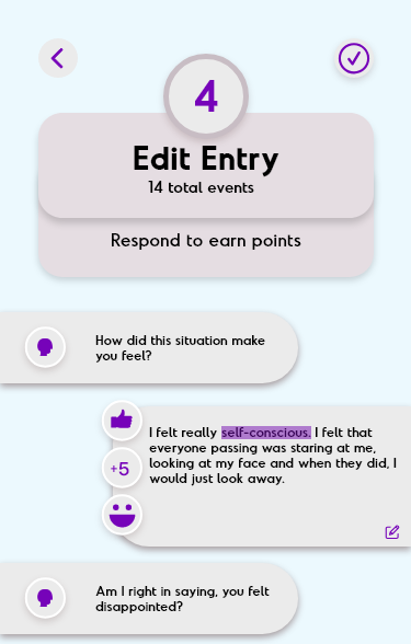
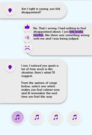
And finally, I have designed the Tickero app interface using Adobe XD. (link) So how does the user earn the Tickero currency? This all happens in the conversational interface element between Tickue – the A.I running the system – and the user. First the user would need to go about their day as they normally do, wearing the TICKBod around their neck. At the end of an event, the user is notified they can provide more detail about that event by having a chat with Tickue through the app. Tickue knows everything afterall, it is a speculative, super-smart A.I system. Tickue has been designed so that it seems to get some things incorrect as a way of testing the user if they are telling the truth during their conversation. For instance, the user may have been feeling sad and Tickue says, ‘I think you were feeling angry, tell me why’. And the user would need to reply ‘No, I was actually feeling sad’. This is an effective method in getting the user to look back at events retrospectively and being truthful, both of which are important when aiming to improve one’s self-help.
Tickue also uses other techniques such as emoticon selection and short quizzes completed by the user. Every time the user sends a message to Tickue, the automatically earn at least 5 points. And the emoticon selection is just another way of getting them to reflect. After all the information is provided from TICKBod and the conversation with Tickue, the user is then rewarded with TICK points, the number of points to decided based on whether Tickue thinks they have done a good job in reflecting and have made progress in improving their self-help.
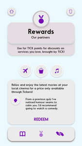
Now we get to the rewards aspect of the currency. The accumulated TICK points can be used for real world benefits in a variety of ways deemed as improving one’s self-help. For example, exercise, entertainment, travel and so on. The rewards are personalised to the person. The data gathered by Tickue is used to determine what rewards are displayed to the user. If Tickue thinks that this person would benefit greatly from a trip to the happiest country in the world, Tickero would help facilitate that by allowing the user to use their TICK points to discount the cost of that journey.
Project Feedback:
There was mixed feedback from my classmates. One person said I should completely remove the TICKBod from the system and focus the interface on asking for the users mood and reflection. I don't think this is a good idea. The idea behind the speculative artefact is, it's the main point of data collection about the users day. Instead of having the user input manually the events in their day as this will take a very look time and would be tedious, it is already done by the system. Therefore, I think the TICKBod is an essential part of the system.
Furthermore, there was some discussion about the graph incluuded on the main screen of my interface. Someone mentioed it could actually be in the form of an emotional wheel diagram. This is a diagram which shows a range of different emotions, for eample fear,disgust, happy and sad. It then goes into further detail for the specific feeling. I think incoporating this could prove to be a good idea as it could expose the user to the feelings they have. It could inform them essentially allowing them to improve.
Another piece of feedback was regarding the emoticon selection and how it could be expanded to include any emoticon from a smartphone’s emoji keyboard. Whilst this would give the user greater choice, I do not see the benefits of it. What if a user selects the broccoli emoji? A human wouldn't be able to understand what they mean by selecting that, let alone artificial intelligence. I think giving the user options from selected emoticons makes the most sense.
Whilst there was only positive feedback by my peers for the Tickero marketing website, I realised that it didn't preform the functions a marketing website should. It was too simple. So I decided to completely redo the site and the result can be seen below.
Now the site displays the interface and gives the user more information on how the system works. Demonstrating the conversational interface and listing some rewards. These were missing from the previous site.


Comments