Data Omniscience Interface Design
- Fisnik

- Apr 14, 2020
- 5 min read
Updated: May 10, 2020
This blog post shows the beginning of my design process where I designed low fidelity wireframes to stimulate ideas on how I would like the interface to look, what sections it needs, and possible interactions. In my previous blog post, I discussed the level of my economies of scope, the variety of data I would like to include. Now I will experiment with interface design to find a suitable way to organise this data.
My interface will take the form of a dashboard.
A quick internet search of dashboard design returned these images:


As much as these designs look good, producing something similar didn't feel like the right thing to do. My project aims to expose data that's so personal to an individual, it didn't make sense to go with light, bright colours. Happy thoughts and feelings are not what my interface should aim to invoke. However, the interface should produce feelings of hostility/guilt towards it, meaning the user should feel hesitant to access and expose themselves to someones sensitive data. I don't want my interface to normalise browsing through somebodies personal data.
Searching for 'futuristic dashboard' and 'data dashboard':


This is exactly what I would like to reproduce in my design. The dark colours, command-and-control style, I think would work extremely well for this type of interface. This incites feelings of power through the overseeing of information.
Style Guide

The image above shows some testing I conducted when choosing my typography for the interface. The typeface I have chosen is 'Bitsumushu'. I chose this typography because I believe it provides connotations of an algorithm. For example, the x-height is really low making words look squished. It also looks dystopian therefore I believe it's fitting to use this font for my titles and subtitles.
For my body text, Kefa will be used. The majority of the interface will be populated with images and repeated designed elements, for example where data will be shown. There won't be many words appearing on the screen apart from the making an inference section of the site.
My interface design has taken an angled approach for the components. I believe this gives the interface an overall futuristic look. I don't think I would have gotten the same effect if I made these components a box shape.

Wireframes

Dashboard interfaces seem to take up all the screen real estate there is. This is what I have reproduced in my design. At the moment the design is boxy and aims each section to fit together. This is not necessarily something I want to continue in my higher fidelity prototypes, this is just a simple outline of how I am currently thinking about the hierarchy and design of my site.
I like the idea of a filter which allows the user to select and view specific data collected. Whether this is camera or wearable data. It would be fantastic if this HTML element could then control what is seen in the Unity feed, and update in real-time, I would need to find out whether this is possible.
Placing the Unity feed in the centre makes it the focus. Whilst this dashboard is the outcome for my FMP, I will also be visualising the data through Unity, similar to the DoppelLab project mentioned in The Age of Surveillance Capitalism.
I am still experimenting with the design of the content in the sections. For example, how will I display the camera images? I would love to incorporate as much animation and movement as possible in my site. I think movement is really what makes a 'surveillance' website pop, along with animations which give it that futuristic, dystopian feeling. This would require I design the elements in a way which also portray these feelings.
Update to the layout:
The current layout was designed as a placeholder for the HTML code. It's not going to be that symmetrical, rather asymmetrical. Some data elements will be larger than others. For example, the 'camera' data will span across the screen horizontally. This is because images are going to be displayed, and I want as many of them to be visible when the interface is loaded, then using CSS overflow scroll to hide the rest. For the 'microphone' data, this can be really smaller as there will only be sound files listed, which can then be played. This is the same as the phone 'activity' data. For the 'wearables' data, this will be the second largest element as there is a lot of collected data that can be shown. The images below so some sketching and wireframing for the new layout, which I plan to code into the site later.
I continued developing my wireframes to experiment with a graphic style that was unique, not just box-shaped. These images below show my thinking.
Dashboard Overview Page

I really like the angled design language I have gone for with this design. I believe it provides connotations of an interface which seems futuristic in a way. I like how the separate elements such as 'wearables' and 'camera' seem like they fit together.
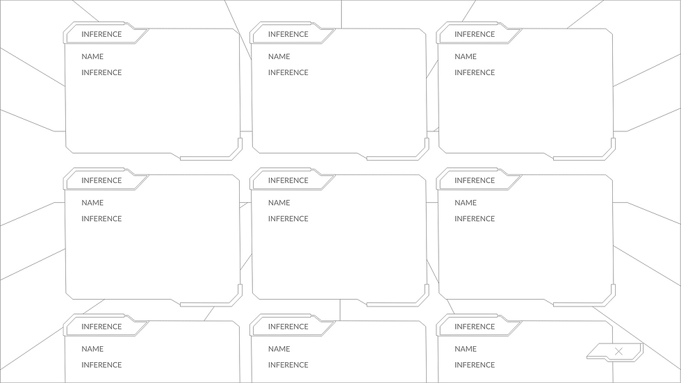
Submit an Inference Page

View all Inferences Page
Submit a promotion

I began designing higher fidelity prototypes using Adobe XD.

I want to give the website a three-dimensional feeling. As my project is about placing the user in these data algorithms 'shoes', whilst they conduct their data collection on our devices, it makes sense that the interface allows the user to feel like they are inside an algorithm. Therefore, I designed a background for my site from a one-point perspective. When placed in the background, this would give the illusion of depth on the flat interface, and it's as if the elements are being brought forward from the centre of the interface for the user to see. The image below shows the result.

I didn't like the result. It doesn't actually look like the 'Microphone', 'Wearables', 'Camera', 'Activity' boxes were being brought forward from the centre (the one-point perspective). I moved these elements, to overlap and be displayed at angles. This was the result:

I believe this now gives the illusion I was hoping for. I am still not sure how I feel about the background design.

I went on to develop this design though code. This proved extremely difficult due to the intricate placements of the elements. I decided this interface would be the appropriate time to have a go at using CSS Grids for the first time. After the session with Johnny in class, I had been looking forward to developing this particular skill. I managed to get the elements placed as I designed in Adobe XD, using a combination of CSS grid rows, columns, and CSS margin.
The feedback I received for my background design overwhelmingly agreed with me. Too much was happening in the background, hurting the user's eyes, and also distracting them. I knew I needed to limit the number of lines in there perspective, and more 'white space', basically stretch it out a bit.
Whilst I was coding my site, I came across CSS perspective grids. This allows perspective to be added to an HTML webpage. I found some examples of perspective grids on codepen which were animated. I managed to incorporate an animated grid to the background of my site, however, there are some issues I am experiencing with the code. The image below shows the new background incorporated into the design.

Link to interactive prototype: https://d-o-d.netlify.app/
Reference list:
Behance.net. (2019). Dashboards: Showcase 2019. Available at: https://www.behance.net/gallery/88895219/Dashboards-Showcase-2019 (Accessed: 19 Apil 2020).
Dr Wong. (2019). Dashboard UI Design Inspiration: A Roundup by Afterglow, Outcrowd and more. Available at: https://drwong.live/art/design/dashboard-ui-design-inspiration-roundup-afterglow-outcrowd-and-more/ (Accessed: 19 Apil 2020).
ivan111183. (2020). Hud interface futuristic dashboard with screen vector image on VectorStock. Available at: https://www.vectorstock.com/royalty-free-vector/hud-interface-futuristic-dashboard-with-screen-vector-22349563 (Accessed: 19 Apil 2020).
smeagorl. (2020). Futuristic virtual graphic user interface hud vector image on VectorStock. Available at: https://www.vectorstock.com/royalty-free-vector/futuristic-virtual-graphic-user-interface-hud-vector-20836011 (Accessed: 19 Apil 2020).
TronicsZone. (2020). PCB Design Services | Complex Circuit Board Design by Experts. Available at: https://www.tronicszone.com/pcb-design-services/ (Accessed: 19 Apil 2020).
uni corn (2018). Medical Dashboard UI. Available at: https://www.behance.net/gallery/66529495/Medical-Dashboard-UI (Accessed: 19 Apil 2020).
YummyBuum. (2019). Route dashboard. Futuristic route UI. Available at: https://creativemarket.com/YummyBuum/4109328-Route-dashboard.-Futuristic-route-UI?u=Traint&utm_source=Pinterest&utm_medium=CM%20Social%20Share&utm_campaign=Category%20Social%20Share&utm_content=Graphics%20%7E%20Page%20289%20%7E%20Creative%20Market&ts=201909 (Accessed: 19 Apil 2020).


Comments