Final Feedback & Presentation
- Fisnik

- May 29, 2020
- 4 min read
Updated: Jun 4, 2020


In my final presentation, I began by discussing what my final outcome was and breaking down key parts of the interface. I then reminded the audience what my brief was, and the key research I conducted. I decided not to do a live demonstration of my interface because I felt I could get across what I wanted to explain through a static image. Also because during feedback my peers could access my interface and browse themselves.
I prepared a script for my presentation because I feel more comfortable planning what I am going to say. I tried not to include as much text on the presentation slides to detract from the images. I think I found a good balance between images, text, and what I actually said during the presentation.
This is what my flow looked like:
Discussing my final outcome.
Breaking down the interface and describing what each section does.
Discussing what the centre console does.
A reminder of my brief.
Key research what moulded my outcome.
How certain elements of my project linked to issues of online surveillance, such as online browsing, online shopping.
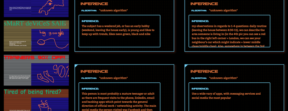
Showcasing some adverts and inferences submitted through my interface.
Feedback I received from my peers through Miro

The overall site is a great use of a dashboard-style interface for critical purposes. You use data-overload to a great effect in positioning the user as a centralised surveillance-capitalist style algorithm and guide them towards the production of an advert well. The styling has been tamed well from the initial uber sci-fi version but still retains some of your visual personality. It's complex, but that's fitting given the topic, and by beginning the build early you've been able to refine it really well.
this, for me, is still the weakest part, I think that you'd benefit from considering the ways that algorithms work by which I mean, the fact that they are unlikely to have fully-free outputs like a paragraph of text, but instead work on probability/ weighting so, considering what kind of algorithm the user is positioned as what are the things they could infer? What is their programming/training? if it's an ad-algorithm, then it's likely that they are trying to put the user into consumer related categories, so that might be things such as income range, age, location, likes, hobbies you start to do this with the how to/ description on the left but I (still) think that it could be better done *through the interface* rather than through instruction
This questions from the book "Should we accept this data collection...." seems to be a nice encapsulation of the what you are asking the user. Is there are point toward the end of the experience where you can bring the user back to this reality or pose this question to them?
The explanation about Inferences on the left is helpful but is quite a lot to read. It would be good to have one or two templated examples on this page to elucidate further.
Since you've populated this with content for 'Data Analysis' and 'Behaviour Detected' the whole piece has got a lot more coherent for me. The choice of proposed behaviours presents a quite extreme perspective, making the algorithm (i.e. your interface and the user) seem hugely presumptuous, intrusive and calous about privacy. I think this pushing the interface to have this personality really adds a lot.
+1 well done for stepping back and seeing that the initial unity section wasn't helpful to your intentions, and for moving it towards something that aids the coherence
Interesting Concept, Cleverly presented. Just one question is it meant to demonstrate to me the amount of data collected about a person only. Or is it meant as a tool for conversation and a critique on the current state of 'Free' services.
It's a great concept that informs users about processes that occur on a daily basis, however I guess the majority of them is not so aware of these processes and data collection. I like the interface that has very strong, recognisable aesthetics. For the future development I think it'd be great to allow everyone to build their own experiences in order to become more aware of how this digital world works now.
Overall, the feedback I received was constructive. There were many questions which allowed me to develop a rationale for specific aspects of my project. For example, someone asked: "What was the reason for choosing this design style. Fonts, Layout, Colours, etc". to which I replied:
"For my website style, I went for a one-point perspective design as I believe it gives the illusion of the data being brought forward from the centre of the screen for the user to view. I have used animations such as increasing the scale of elements when they are on hover. I feel like this gives that effect. I went for a compact visual layout as I believe this gets the idea of economies of scale and scope across really well as the interface is being filled to the point where there is no more room.
I wanted to use a font which gave connotations of surveillance and combining this with a dark aesthetic I feel works well. It’s like your viewing something that should exist, just like maybe surveillance capitalism should exist?"
I really enjoyed this method of feedback. Generating feedback on the spot is something I need to develop. I much prefer to take the time to go through someone's work myself. I feel in class during a crit format, I find it difficult to pay to attention them whilst talking, and look at their presentation, and then give them feedback afterwards.


Comments