Cam Wars: Interface Development
- Fisnik

- Oct 18, 2019
- 3 min read
Updated: Jan 14, 2020
I began designing a new interface for my project as I wasn't happy with the first design. I conducted some research on CCTV camera viewing interfaces. I looked at a whole variety of manufacturers starting with Defeway, Axis, Swann and noticed some similarities. I aimed to reproduce these similarities in my interface.


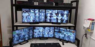
Most of the interfaces had distinct placement of elements. For example, the HUD for zooming in and out of a camera would be centralised in the interface. The live feed would also be in the centre and take up the whole screen. I think this is where my previous interface design fell short. The two feeds were being displayed in the centre of the screen, but they at a set width and height, leaving a lot of white space around the interface. This time, I want to display 6 feeds in one go. I believe this would give the user a stronger feeling of surveillance and being the person conducting the surveillance. I believe the images above provide a good example of what I could aim for. I think this is the atmosphere I want my system to produce. The images below show my new design:


Visit the website here.
After the user testing I conducted, I came to a conclusion to change certain aspects of the UI design. For example, some respondents stated the disappearing menu was confusing as people who aren't knowledgeable on surveillance interfaces would not know about specific features. Therefore, I decided to locate the menu on the top and make it appear all the time. Whilst I did like the disappearing menu aspect and thought the connotations of surveillance really excelled, I decided to leave it.
The images below show the updated menu.


Responsive Design
I decided to continue developing the site into a responsive one, allowing the user to access it through their mobile devices. I did this not because it was necessary to get the point of unsecured cameras across, but just to showcase my technical ability, and I believe it would be something to show when I write my portfolio post for this project.
The mobile design takes a single collum approach, displaying the feeds underneath each other. I found this was the best way to show the feeds through testing. Using the same 3 by 2 design proved difficult to view the feeds as they were very small.
After I had thought I completed the responsive design, I realised when I opened the site on an iPhone with a notch, the text appeared underneath the cut-out. This was a complete oversight in my design and interface layout. I had already customised the CSS for a viewport width of under 500px, I now had to find a way to customise it further, but specific to iPhones with notches.
After implementing this in my mobile CSS document and applying changes to the relevant divs, and opening the site on and iPhone x, the text now appeared lower, which is what I was aiming for. At the same time, the is no change for devices without the notch.
After conducting some research on how to combat this issue, I came across some advice providing the CSS code specific for iPhone.
@media only screen and (min-width: 375px) and (max-width: 767px) { /* Your Styles... */ }After implementing this in my mobile CSS document and applying changes to the relevant divs, and opening the site on and iPhone x, the text now appeared lower, which is what I was aiming for. At the same time, the is no change for devices without the notch.
The images below show the interface loaded on a mobile device.

I changed how the 'vote' button behaved. It now constantly appears displayed, whereas on the computer interface it disappears and appears on mouseover. The menu is located on the top, with the four categories evenly divided in size based on the viewport width.
Bibliography list:
Cisco. (2019). IP Video Surveillance Design Guide. Available at: https://www.cisco.com/c/en/us/td/docs/solutions/Enterprise/Video/IPVS/IPVS_DG/IPVS-DesignGuide/IPVSchap4.html (Accessed: 15 October 2019)
Reference list:
Times Union. (2013). Tougher security on way for schools. Available at: https://www.timesunion.com/local/article/Tougher-security-on-way-for-schools-4200781.php (Accessed: 15 October 2019)
Getty Images. (2019). Multipath target monitoring. Available at: https://www.gettyimages.co.uk/detail/video/multipath-target-monitoring-stock-footage/538086982?uiloc=thumbnail_similar_clips_adp (Accessed: 15 October 2019)
Cctvcad.com. (2019). Professional design of CCTV system. Available at: http://www.cctvcad.com/CCTVCAD-Professional_design_of_CCTV_system.html (Accessed: 15 October 2019)
Campus Safety. (2019). About Security Guards. Available at: https://www.niagaracollege.ca/campus-safety/about-security/ (Accessed: 15 October 2019)
yesviz.com (2019) APPLE IPHONE X. Available at: https://yesviz.com/devices/iphonex/ (Accessed: 14 January 2020).
Paintcodeapp.com. (2020). iPhone X Screen Demystified. Available at: https://www.paintcodeapp.com/news/iphone-x-screen-demystified (Accessed: 14 January 2020).
Tumult Forums. (2017). Viewport Size for iPhone X?. Available at: https://forums.tumult.com/t/viewport-size-for-iphone-x/11132 (Accessed: 14 January 2020).
WebKit. (2017). Designing Websites for iPhone X. Available at: https://webkit.org/blog/7929/designing-websites-for-iphone-x/ (Accessed: 14 January 2020).


Comments